Color is one of the most powerful and affordable tools in your decorating arsenal. Understanding how different colors affect mood and perception can help you create spaces that not only look beautiful but also feel exactly the way you want them to—without spending a fortune on furniture or renovations.
Share This Article
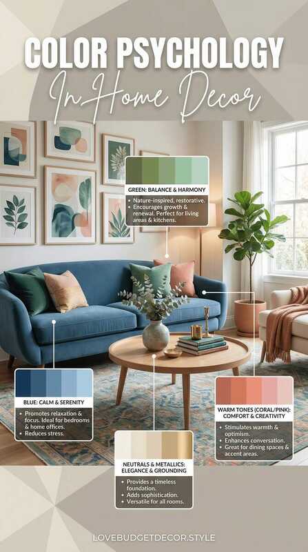
Why Color Psychology Matters in Your Home
Every color triggers specific emotional and psychological responses in our brains. These responses are both universal and personal, shaped by cultural associations and individual experiences. When you understand these effects, you can strategically use color to influence how you and your guests feel in each room. The best part? Paint is one of the most budget-friendly ways to completely transform a space, typically costing under fifty dollars per room when you do it yourself. Better Homes & Gardens' color experts explores the science behind how colors affect mood and behavior.
Beyond paint, you can introduce color through textiles like throw pillows, curtains, and area rugs—all items that can be swapped seasonally or whenever you want a refresh. This flexibility makes color psychology an ideal strategy for budget decorators who want maximum impact with minimal investment.
Warm Colors: Energy and Comfort
Warm colors—reds, oranges, yellows, and their variations—are known for their ability to energize, stimulate, and create feelings of warmth and intimacy. These colors appear to advance visually, making them perfect for creating cozy, inviting spaces or adding energy to areas where you want activity and conversation.
Best Uses for Warm Colors
Red: Stimulates appetite and conversation, making it ideal for dining rooms and social spaces. Use softer tones like terracotta or coral in bedrooms for warmth without overstimulation.
Orange: Promotes enthusiasm and creativity. Perfect for home offices, craft rooms, or playrooms. Muted oranges like peach or apricot work beautifully in living spaces.
Yellow: Evokes happiness and optimism. Excellent for kitchens and breakfast nooks where you want to start the day with positive energy. Avoid bright yellows in bedrooms as they can be too stimulating for sleep.
Budget-Friendly Warm Color Products
MIULEE Velvet Throw Pillow Covers
Available in warm terracotta, coral, and mustard tones
$12-$25
View on Amazon
Cool Colors: Calm and Serenity
Cool colors—blues, greens, and purples—have a calming, soothing effect on our nervous systems. They appear to recede visually, making rooms feel more spacious and tranquil. These colors are perfect for creating restful environments where you want to relax, focus, or sleep.
Best Uses for Cool Colors
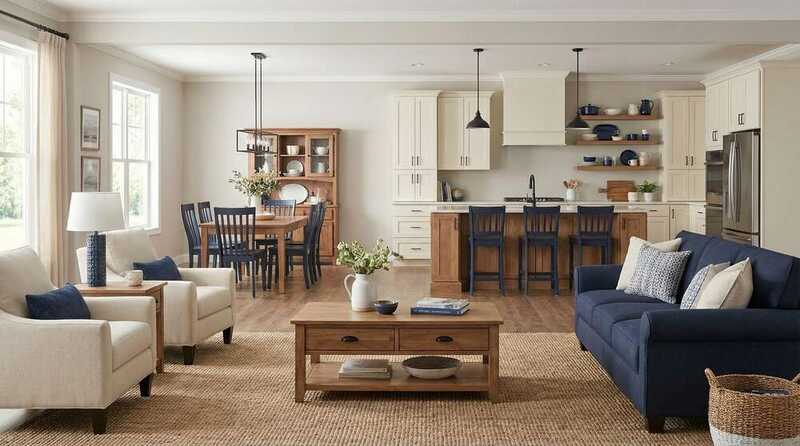
Blue: Lowers blood pressure and heart rate, promoting relaxation and mental clarity. Ideal for bedrooms, bathrooms, and home offices where focus is needed. Lighter blues make small spaces feel larger.
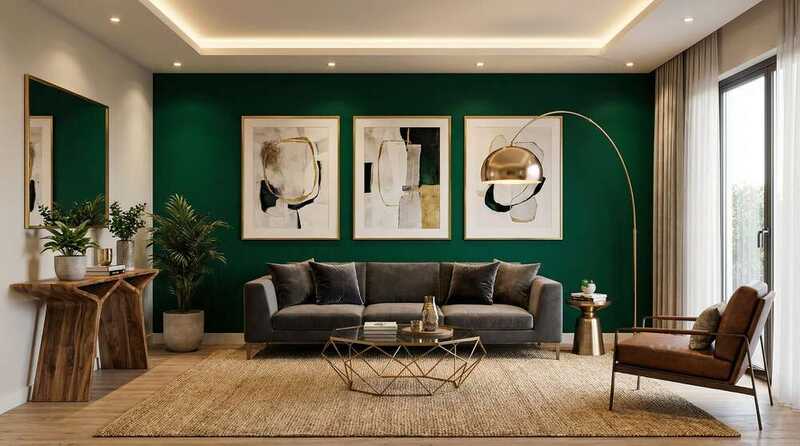
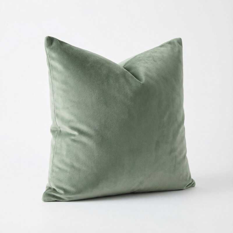
Green: The most restful color for the human eye, associated with nature and renewal. Works in virtually any room, especially bedrooms, living rooms, and bathrooms. Sage and olive greens are particularly trendy and timeless.
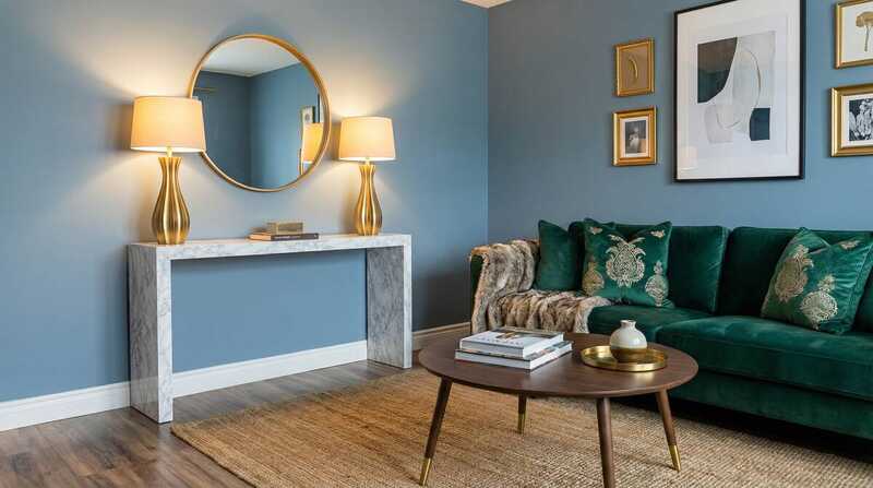
Purple: Combines the calm of blue with the energy of red, creating a sense of luxury and creativity. Lighter lavenders work well in bedrooms, while deeper purples add drama to accent walls or dining rooms.
Budget-Friendly Cool Color Products
Neutral Colors: Versatility and Balance
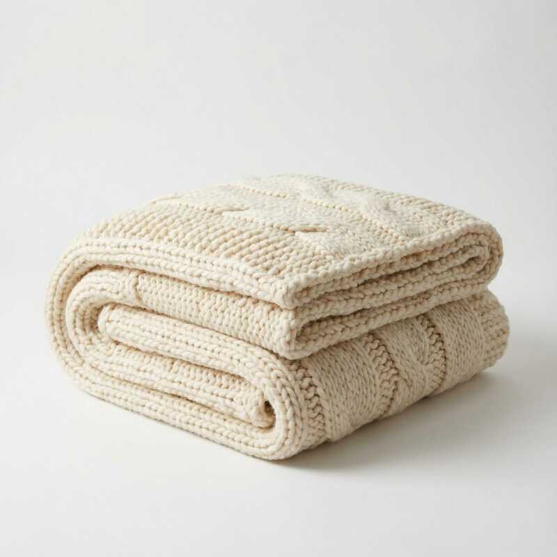
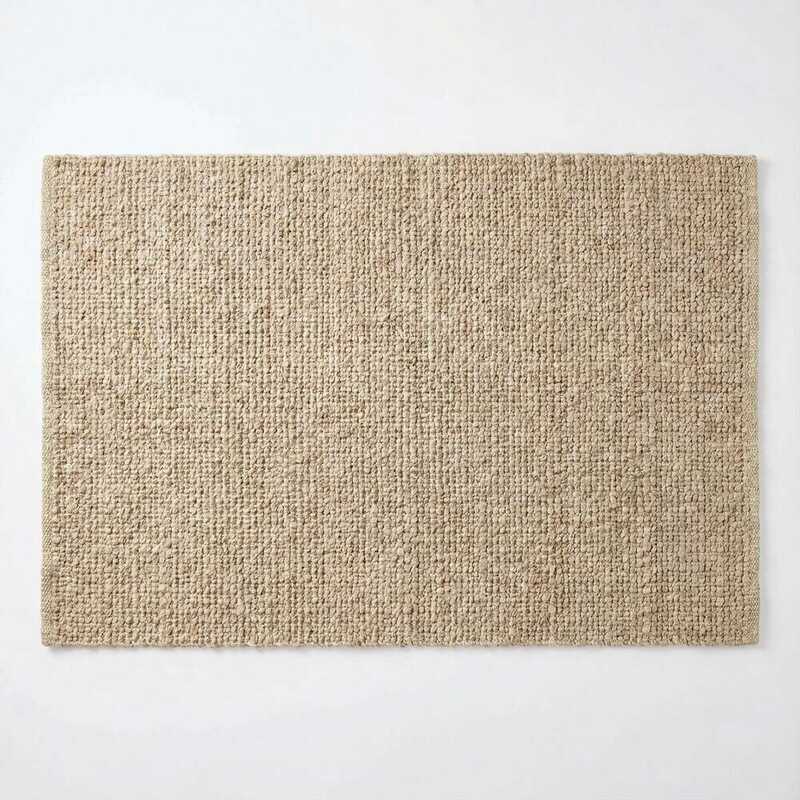
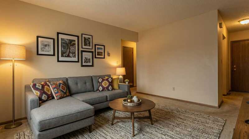
Neutrals—whites, grays, beiges, and browns—serve as the foundation of most successful color schemes. They provide visual rest, create a sense of spaciousness, and allow other colors to shine. Neutrals are also the safest choice for renters or anyone hesitant about bold color commitments, as they work with virtually any style and can be easily updated with colorful accessories.
Modern neutrals go far beyond basic beige. Warm neutrals like greige (gray-beige), taupe, and cream create cozy, inviting spaces. Cool neutrals like pure gray, white, and charcoal offer a more contemporary, sophisticated feel. The key is choosing neutrals with undertones that complement your lighting and existing furnishings.
Neutral Color Strategy
Start with neutral walls and large furniture pieces, then layer in pops of color through easily changeable items like pillows, throws, artwork, and decorative accessories. This approach gives you flexibility to update your look seasonally or whenever your taste evolves, without the expense of repainting or replacing major pieces.
Use the 60-30-10 rule: sixty percent neutral (walls, large furniture), thirty percent secondary color (curtains, accent chairs), and ten percent accent color (pillows, artwork, accessories). This creates a balanced, professionally designed look.
Room-by-Room Color Recommendations
Living Room
Choose colors that promote conversation and comfort. Warm neutrals like greige or taupe create an inviting base, while accent colors in warm terra cotta or cool sage green add personality. Avoid overly stimulating colors that can make the space feel chaotic.
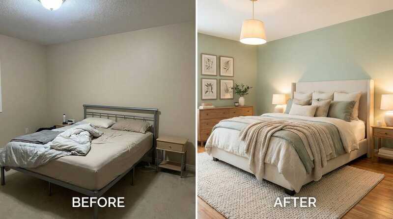
Bedroom
Prioritize restful colors that promote sleep. Soft blues, gentle greens, and muted lavenders are ideal. If you prefer warmth, opt for dusty rose or soft peach rather than bright reds or oranges. Keep the overall palette simple and avoid high-contrast combinations.
Kitchen
Energizing colors work well in kitchens where you want to feel motivated to cook. Warm yellows, soft oranges, and fresh greens create an appetizing atmosphere. White and light neutrals make small kitchens feel larger and cleaner.
Home Office
Choose colors that enhance focus and creativity. Blues promote concentration and mental clarity, while greens reduce eye strain. Add warm accent colors like yellow or orange to stimulate creative thinking without overwhelming the space.
Bathroom
Spa-like blues and greens create a calming, clean atmosphere. Warm neutrals like cream or soft gray also work beautifully. Add pops of color through towels, bath mats, and accessories that can be easily changed.
Common Color Mistakes to Avoid
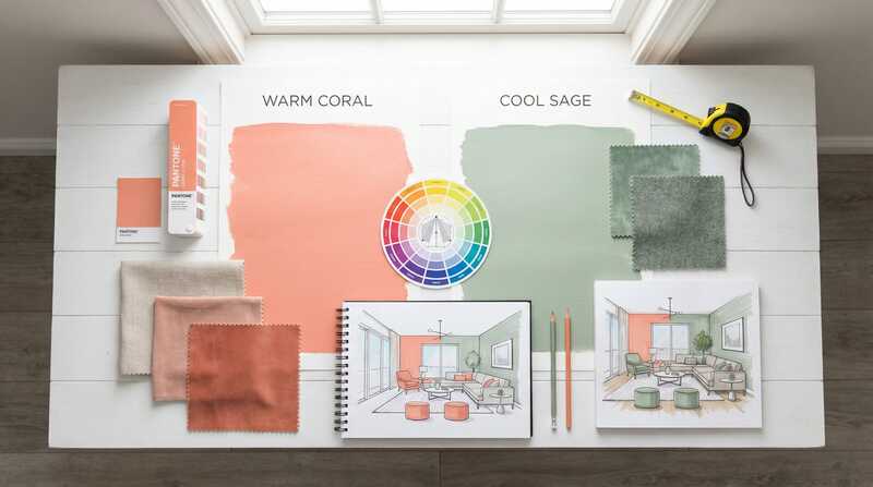
Even with the best intentions, it's easy to make color mistakes that can undermine your decorating efforts. One of the most common errors is choosing paint colors based solely on small samples without testing them in your actual space. Paint looks dramatically different depending on your lighting, so always test colors on your walls and observe them at different times of day before committing.
Another frequent mistake is using too many colors in one space. While variety can be exciting, more than three or four colors typically creates visual chaos rather than interest. Stick to a cohesive palette and use different shades and tones of your chosen colors for depth without overwhelming the eye.
Finally, don't ignore the undertones in your neutrals. A beige with pink undertones will clash with furniture that has yellow undertones, creating an unintentional muddy effect. Pay attention to whether your neutrals lean warm or cool, and keep your palette consistent within that temperature range.
Budget-Friendly Ways to Add Color
You don't need to repaint entire rooms or buy new furniture to incorporate color psychology into your home. Start with the most affordable and easily changeable items: throw pillows, which can instantly transform a neutral sofa or bed. Look for pillow covers rather than complete pillows so you can swap them seasonally without storage challenges.
Curtains and window treatments offer another high-impact, relatively affordable way to introduce color. They frame your view and can dramatically change a room's atmosphere. Area rugs provide both color and texture, anchoring your furniture arrangement while defining the space. Thrift stores and online marketplaces often have beautiful rugs at fraction of retail prices.
Don't overlook the power of artwork and wall decor. You can create your own abstract art with canvas and paint for under twenty dollars, or print high-resolution images from free stock photo sites and frame them. Even temporary solutions like removable wallpaper or wall decals can add color without the commitment or expense of traditional wallpaper.
Quick Color Psychology Reference
For Energy & Warmth:
Red, Orange, Yellow, Coral, Terracotta
For Calm & Relaxation:
Blue, Green, Lavender, Aqua, Sage
For Focus & Productivity:
Blue, Green, Gray, White
For Versatility & Balance:
Beige, Gray, White, Taupe, Greige
Understanding color psychology empowers you to create intentional spaces that support your lifestyle and emotional well-being. Whether you're looking to energize your morning routine with warm yellows in the kitchen, create a peaceful sanctuary with soft blues in the bedroom, or design a focused workspace with calming greens, color is your most affordable and impactful decorating tool. Start small with accessories and textiles, test your choices, and gradually build a color palette that makes your home feel exactly the way you want it to feel.
Related Articles
Affiliate Disclosure: This post contains Amazon affiliate links. When you purchase through these links, we may earn a small commission at no additional cost to you. This helps support our site and allows us to continue providing free content.